Dashboard: System Overview tab
The first tab the dashboard opens on. Four live metric cards across the top, the historical-metrics chart in the middle, and condensed storage / network panels at the bottom — all derived from the same APIs that drive the dedicated tabs.
A read-only snapshot
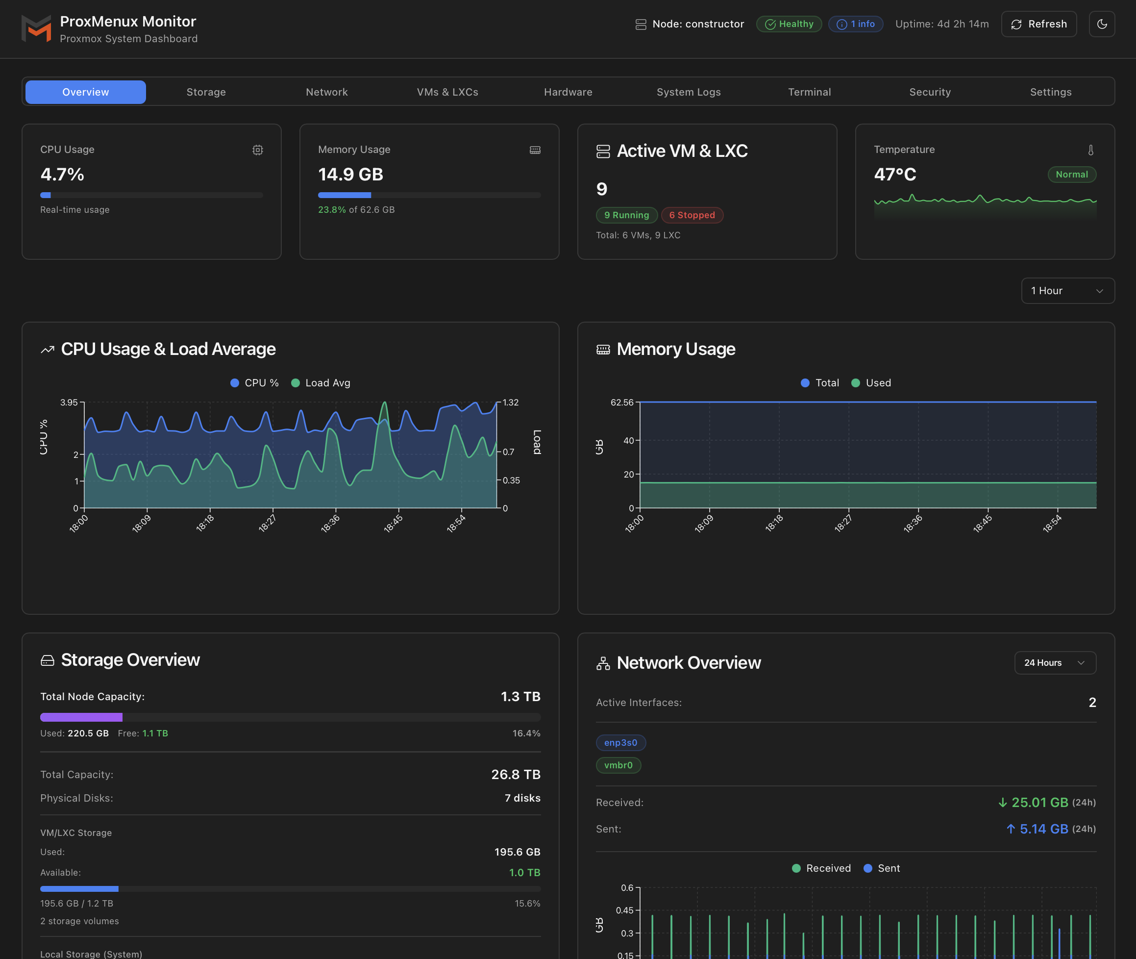
Top row: live metric cards
Four cards in a 2×2 grid on mobile, single row on desktop. Each updates from /api/system every few seconds.
| Card | What it shows | Source |
|---|---|---|
| CPU Usage | Current percentage with a progress bar. Updates ~1 s via the vital-signs sampler. | psutil.cpu_percent() |
| Memory Usage | Used GB, percentage, total GB. Progress bar tracks the percentage. | psutil.virtual_memory() |
| Active VM & LXC | Count of currently running guests, with a Running / Stopped breakdown badge and a footer line for total VMs and LXCs. | /api/vms (consolidated) |
| Temperature | CPU temperature in °C with status badge (cool / warm / hot) and a 5-minute sparkline behind it. Shows N/A when no sensor is detected. Click to open the temperature detail modal. | sensors / coretemp |
Status colours and thresholds applied here
- CPU usage — Warning 85 %, Critical 95 %.
- Memory — Warning 85 %, Critical 95 % (Swap also fires Critical at 5 % used — a healthy Proxmox host should rarely touch swap).
- CPU temperature — Warning 80 °C, Critical 90 °C.
The sparkline is meaningful
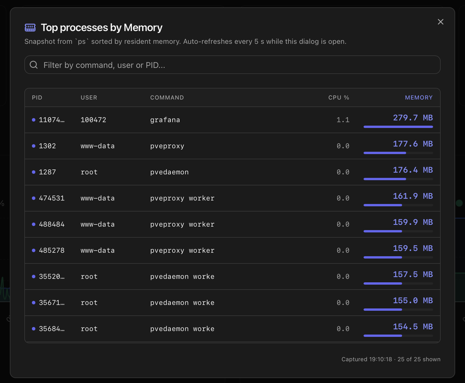
Top processes by CPU / Memory
The CPU Usage and Memory cards on the Overview tab are clickable. Clicking either opens a sortable list of the top 25 processes — ordered by CPU usage when opened from the CPU card, by resident memory when opened from the Memory card.
The list dialog
- Auto-refresh — the list updates every 5 seconds while the dialog is open and stops polling as soon as it closes.
- Filter — the search box narrows the list by command, user or PID.
- Inline bar — the primary metric column draws a small bar scaled to the highest value in the filtered list, so ranking stays visible even when no process is near 100 %.
- Mobile layout — under 640 px the PID and User columns hide so Command, CPU % and Memory still fit on a phone screen without horizontal scroll.
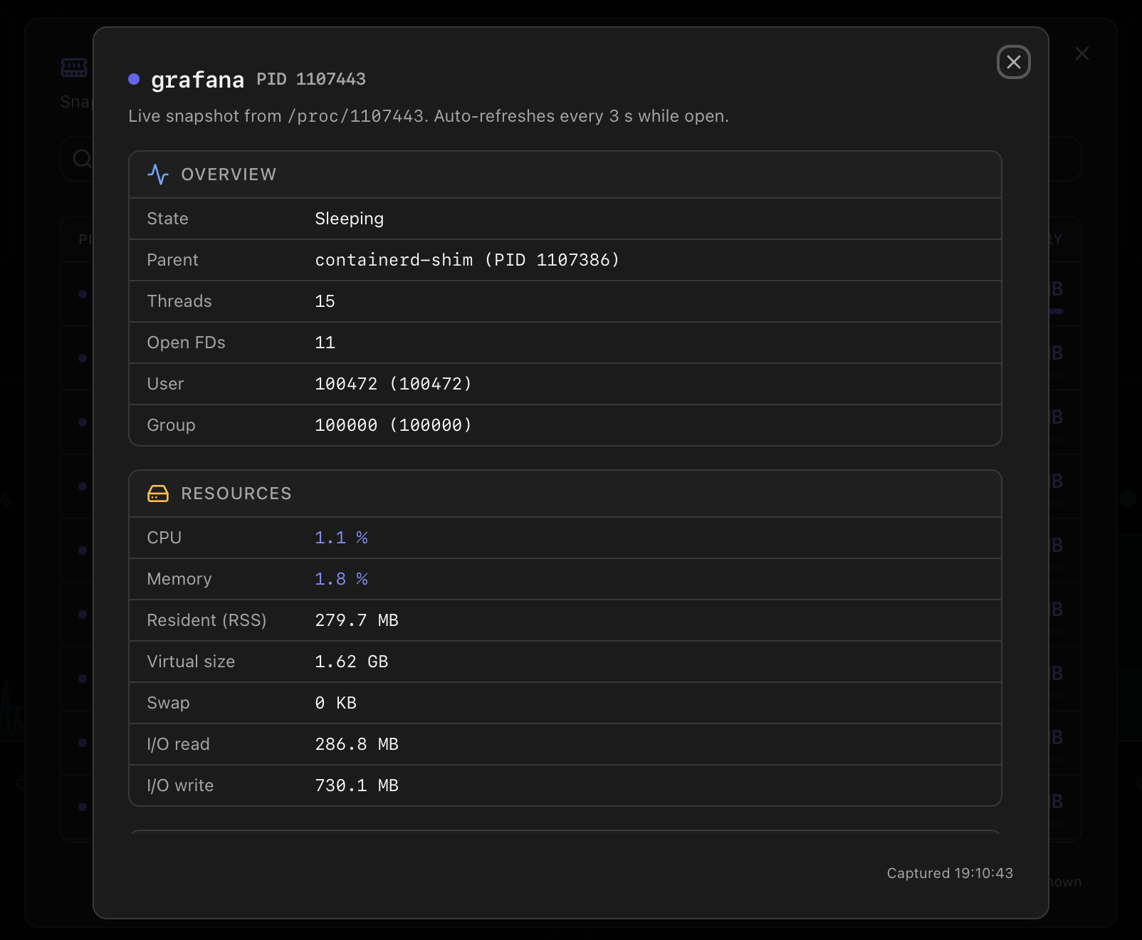
Per-process detail
Clicking any row in the list opens a second dialog with the live picture of that one process, organised in four sections:
- Overview — state, parent process, thread count, open file descriptors, user and group.
- Resources — CPU %, Memory %, Resident (RSS), Virtual size, Swap, I/O read and write totals.
- Command — short name, full command line, executable path and working directory.
- Lifetime — start timestamp and elapsed runtime.
The detail dialog refreshes every 3 seconds while open. If the process finishes mid-dialog, polling stops, an amber This process has finished banner appears, and the last captured snapshot stays on screen (dimmed) so you can still see what was happening just before it ended.
Middle: node metrics charts
Below the top row sits the NodeMetricsCharts component — historical CPU, memory and disk-I/O graphs sourced from Proxmox's own RRD store via /api/node/metrics. A timeframe selector switches between 1 hour / 24 hours / 7 days / 30 days / 1 year; data resolution drops as the window grows so the chart stays smooth.
These are the same graphs that the Proxmox web UI renders for a node, just consolidated into the Monitor's dark theme and aligned with the other panels.
Bottom row: Storage & Network summaries
Storage Overview card
A condensed view of the host's storage state, broken into three blocks:
- Total Node Capacity — sum of all VM/LXC storages plus the local system storage, with a gradient progress bar of the total used / free split.
- Total Capacity / Physical Disks — raw capacity headline and the count of physical disks discovered.
- VM/LXC Storage — used / free / percentage for the storages where guests live, plus a counter when more than one is configured.
- Local Storage (System) — the host's own root / system mount, separately from the guest pool.
Drill-in lives in the Storage tab — per-disk SMART, ZFS pool details, observation history, etc.
Network Overview card
Top line shows the count of active interfaces (physical + bridges combined). Below that, two rows of coloured badges for the interfaces that are up — physical NICs in blue, bridges in a secondary colour. A timeframe selector at the top right (1 hour / 24 hours / 7 days / 30 days / 1 year) controls a small RX / TX traffic chart.
Per-interface drill-in (IP/MAC, RRD chart, bridge members, bond mode, etc.) lives in the Network tab.
Refresh model
Each panel manages its own loading state (loadingStates.cpu, loadingStates.storage, …) so a slow source doesn't block the rest. While a panel is fetching, it shows a pulse-animated skeleton; failed fetches degrade gracefully — for example, a missing temperature sensor renders the card as N/A instead of an error.
- Top metric cards — refresh every ~5 s. The CPU and temperature panels also receive a 1 s push from the vital-signs sampler.
- Node metrics chart — refresh every 30 s, or on timeframe change.
- Storage card — refresh every 60 s. SMART data is cached longer (the Storage tab triggers a fresh read on demand).
- Network card — refresh every 5 s on the active timeframe.
- Manual refresh — the Refresh button in the header forces all panels to re-fetch immediately.
How the data is collected
| Card | Endpoint | Source |
|---|---|---|
| Header status pill | /api/health | The cached overall status produced by the Health Monitor each cycle. |
| CPU / RAM / Swap / Uptime | /api/system | /proc/stat, /proc/meminfo, /proc/uptime with short-window CPU sampling. |
| Host info (kernel, BIOS, distro) | /api/info | uname -a, dmidecode, PVE version. Cached per process. |
| Storage / network / VMs cards | /api/storage/summary, /api/network/summary, /api/vms | See the dedicated tabs for each. The header cards show a compacted view from the same endpoints. |
| Refresh cadence | — | CPU / network 5 s; storage / VMs 30 s; static info every 5 min. The Refresh button in the header forces an immediate re-fetch on every panel. |
# Single call that backs the header pill
curl http://<host>:8008/api/health   # public, no token

# Authenticated snapshot used by the cards
curl -H "Authorization: Bearer <token>" \
  http://<host>:8008/api/system | jq '.cpu,.memory,.uptime'
Where to next
- Health Monitor — the modal behind the header status pill (ten categories, dismissals, suppression).
- API Reference — the system, info and health endpoints.
- Notifications — how the same statuses turn into Telegram / Discord / Email messages.
- Dashboard index — the other eight tabs at a glance.
- Architecture — the background threads and APIs that power this view.