Dashboard: Network tab
Every interface the kernel reports — physical NICs, bridges, bonds, VLANs and VM/LXC virtual ports — grouped into three cards. Each row is clickable and opens a drill-in with addressing, traffic counters and historical RRD data.
Live + historical, both included
psutil.net_if_stats() and ip; historical bandwidth from Proxmox's RRD store via /api/network/<interface>/metrics. The page refreshes every ~5 seconds for live counters and pulls fresh RRD data on demand for the chart.Top row: four stat cards
| Card | What it shows |
|---|---|
| Network Traffic | Aggregate RX / TX rate across all interfaces, formatted in the right unit (bps / Kbps / Mbps / Gbps). |
| Active Interfaces | Two counters: Physical X / Y and Bridges X / Y (active over total). The first counter you watch when something stops working. |
| Network Status | Quick verdict — Healthy / Warning / Critical based on link state, gateway reachability and bridge integrity. Mirrors the Network Interfaces category of the Health Monitor. |
| Network Latency | Round-trip time to the gateway with a sparkline. Clicking the card opens the Network Latency modal documented further down — historical view + on-demand ping test against gateway / Cloudflare / Google with a downloadable PDF report. |
Network Flow diagram
Between the top row and the three group cards, the tab renders a live topology view called Network Flow. It draws every path a packet can take through the host — physical NICs at one end, bridges in the middle, VMs and containers at the other — with animated pulses that show real-time rx/tx traffic on each link.
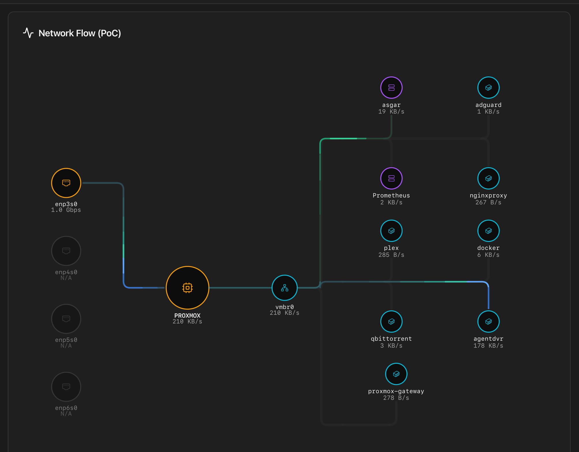
What the diagram shows
Every node is one entity from the same inventory used by the group cards below, but arranged as a topology so relationships between them are immediate:
- NICs (amber) — every physical interface with link up. Interfaces reported as down are drawn faded.
- Host (amber) — the Proxmox host itself, sitting between the NICs and the bridges. Rendered as a fixed anchor; not clickable.
- Bridges (cyan) — Linux and OVS bridges. Only bridges that carry at least one active guest are drawn; unused bridges are hidden to keep the diagram focused on what actually moves traffic.
- LXCs (cyan) — running containers attached to a bridge.
- VMs (purple) — running virtual machines attached to a bridge.
- Offline guests (stopped VMs / containers) are hidden.
What the animation encodes
The animated comets that travel along each edge represent live traffic:
- Direction — a pulse flowing toward the NIC is tx from the guest; toward the guest is rx.
- Stroke width scales with the guest's combined rx+tx rate. An idle guest still draws a faint animated line; a busy one gets a thick one.
- Comet head glow — warm at ~1 MB/s, hot at ≥30 MB/s. Useful to spot at a glance which guest is dominating a NIC.
- Click — every node except the host is clickable and opens the same per-interface drill-in modal documented below. Tapping the host is intentionally a no-op — there is no host-level modal in this view.
When it's useful
Three interface groups
Below the top row, three cards split the inventory by role. Each card has its own active-count badge in the header. Interface type is identified at a glance by a coloured badge on every row:
- Blue Physical — real NIC.
- Green Bridge — Linux bridge or OVS bridge (
vmbr*). - Purple Bond — bond / LACP / active-backup aggregator.
- Cyan VLAN — VLAN sub-interface (
vmbr0.10,eno1.42, …).
Every row is clickable — physical, virtual, bridge or bond — and opens the per-interface drill-in described further down (basic info, IPs, traffic counters, historical RX/TX chart from Proxmox's RRD store).
Physical Interfaces
Every NIC the kernel sees as a real device — eno1, enp4s0, eth0, wlp3s0, etc. One row per device with the blue Physical badge and the link state. Bond members (NICs enslaved to a bond) are shown here too, with a hint pointing to the parent bond.
Bridge Interfaces
Linux bridges (vmbr0, vmbr1, …) and the OVS bridges Proxmox manages. Each row shows the green Bridge badge, the underlying physical interface (when it's a single-port bridge), and the bridge state. Bonds visible at this layer get the purple Bond badge; VLAN sub-interfaces get the cyan VLAN badge.
VM / LXC Interfaces
The tap* and veth* interfaces created when guests start — one per virtual NIC. The card header shows X / Y Active; rows are linked to the VM/CT they belong to so you can jump directly to the guest in the VMs & LXCs tab. Inactive entries hang around briefly after a guest stops; they age out within a refresh cycle.
Per-interface drill-in
Clicking any row opens a modal with five blocks:
| Block | Contents |
|---|---|
| Basic Information | Interface name, type (physical / bridge / bond / VLAN / vm), MAC address, state (up / down), MTU, and the underlying physical interface for non-physical types. |
| Bond Members | Only for bonds. Lists each enslaved NIC with the active / failed flag, the bond mode (active-backup / 802.3ad / balance-alb / …) and the primary interface when configured. |
| IP Addresses | Every IPv4 / IPv6 address with the prefix length. Auto-configured link-local addresses are listed but greyed out. |
| Historical chart | RX / TX bandwidth over the selected timeframe (1 hour / 24 hours / 7 days / 30 days / 1 year), pulled from /api/network/<interface>/metrics (Proxmox RRD). |
| Traffic since last boot | Total RX / TX bytes and packets since the host last booted, plus error and drop counters. |
Inactive interfaces still open the drill-in
Network Latency modal
Clicking the Network Latency card in the top row opens a dedicated modal. It has two modes (historical and on-demand test), three target options and a downloadable PDF report.
Targets
A target dropdown at the top of the modal selects what gets pinged:
- Gateway — your LAN router. Tests the local-network leg only; useful when you suspect a switch / cabling issue and want to rule out the WAN.
- Cloudflare (1.1.1.1) — public DNS resolver, anycast network. Tests the WAN leg.
- Google (8.8.8.8) — alternative public target, useful as a sanity check or when Cloudflare is regionally degraded.
Mode 1 — Historical view
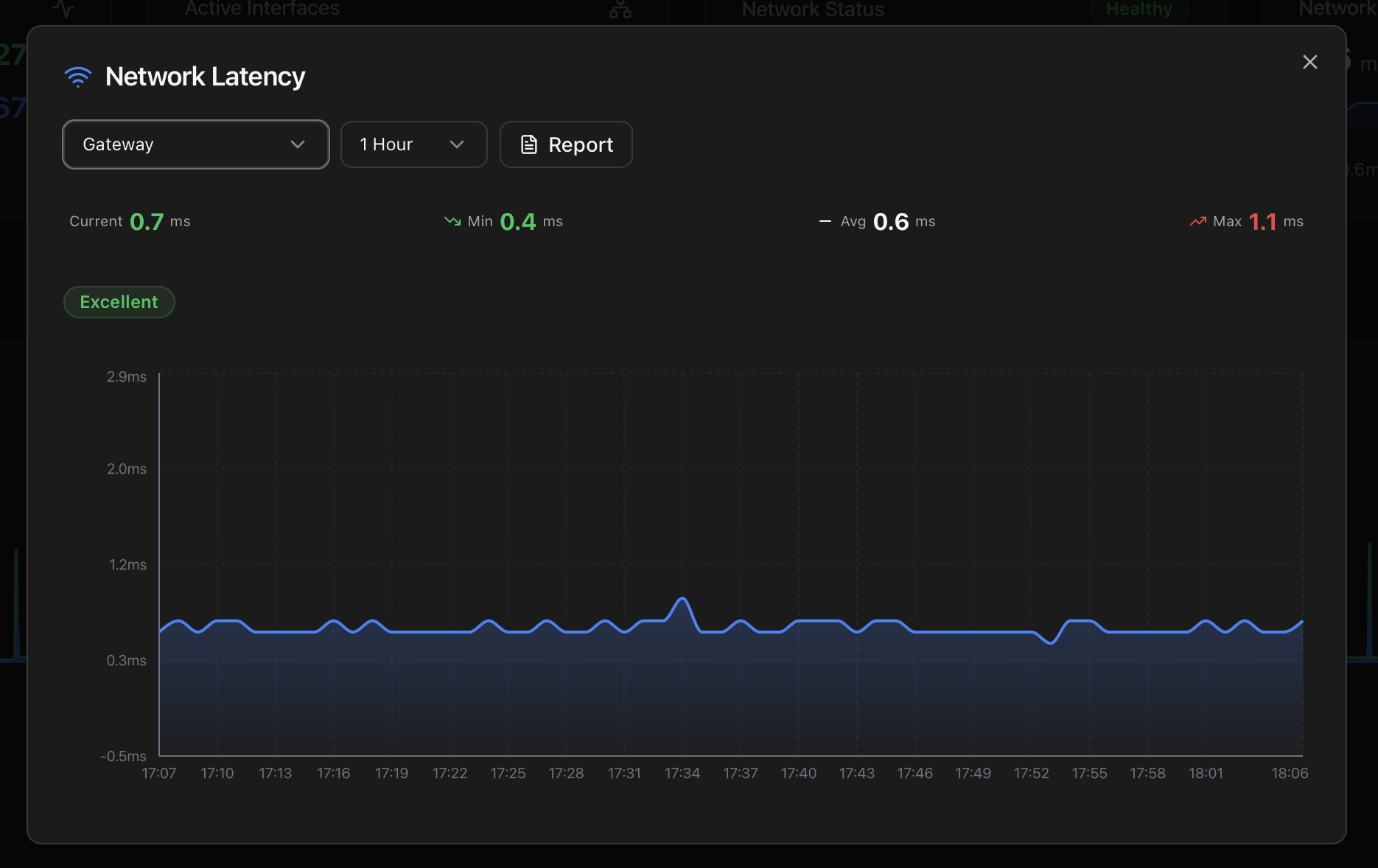
The default mode when the modal opens. A second dropdown picks the timeframe (1 Hour / 24 Hours / 7 Days / 30 Days / 1 Year); data resolution drops with the window so the chart stays readable. Headline stats — Current / Min / Avg / Max — render above the chart, with a status pill (Excellent / Good / Fair / Poor) reflecting the current value against the thresholds below.
Source: the same latency samples the Health Monitor uses to detect persistent network slowdowns — sampled every 60 seconds against the gateway by the background _temperature_collector_loop thread, written to a local SQLite history.
Mode 2 — Real-time test
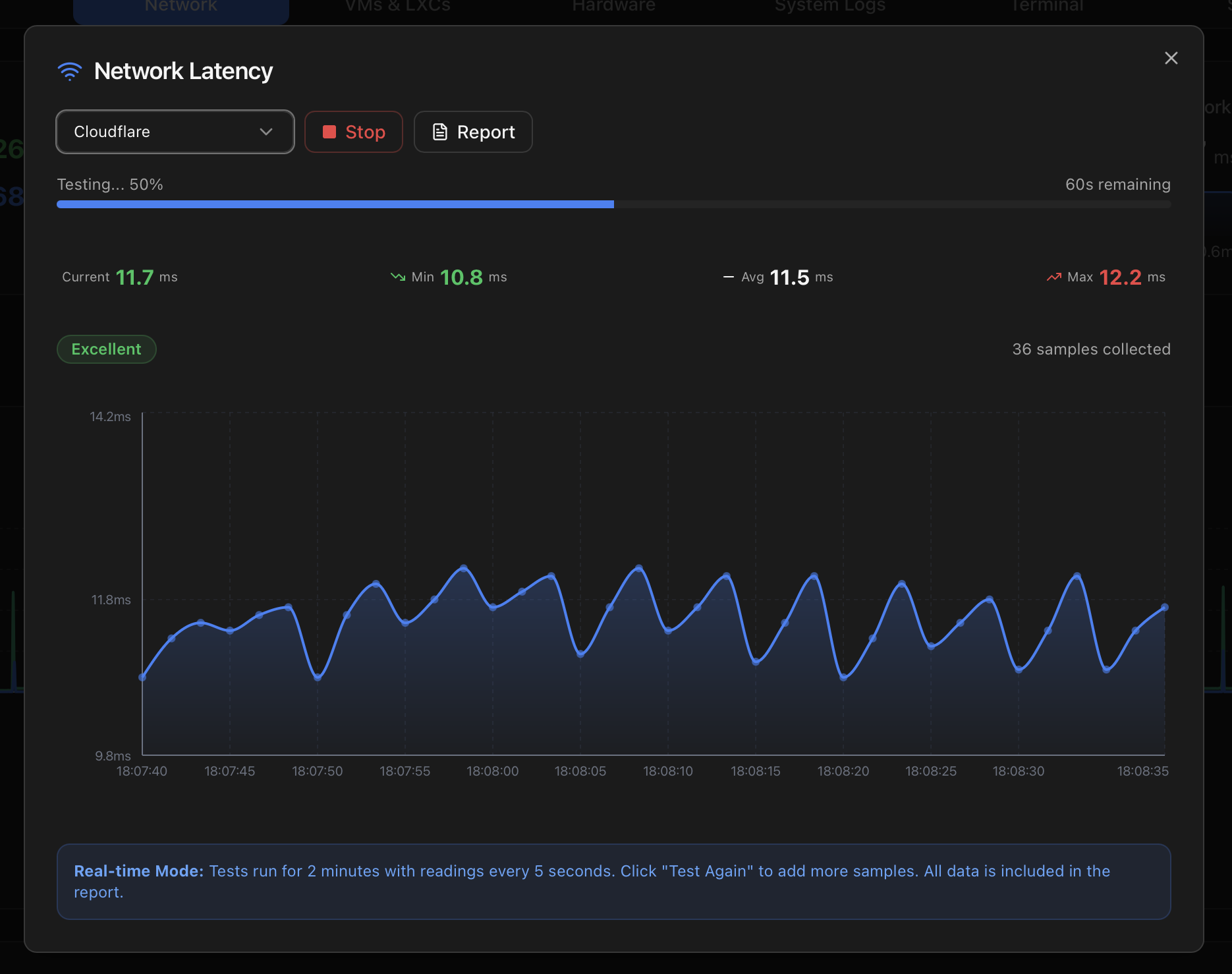
Switching the target to Cloudflare or Google starts an on-demand ping test. Behaviour:
- Duration — 2 minutes per run, with a progress bar and a remaining-seconds counter.
- Cadence — one reading every 5 seconds (24 readings per run).
- Method — ICMP Echo Request (
ping), 3 consecutive pings per sample, latency averaged. - Stop — ends the test immediately; partial data is preserved.
- Test Again — appends new samples to the existing dataset rather than starting fresh, so you can build a longer record across several runs.
- Live status pill — re-evaluates after every sample using the same Excellent / Good / Fair / Poor thresholds.
Performance thresholds
| Status | Range | Practical impact |
|---|---|---|
| Excellent | < 50 ms | Optimal for real-time apps, gaming and video calls. |
| Good | 50 – 100 ms | Acceptable for most applications with minimal impact. |
| Fair | 100 – 200 ms | Noticeable delay. May affect VoIP and interactive apps. |
| Poor | > 200 ms | Significant latency. Investigation recommended. |
Network Latency Report (PDF)
Both modes have a Report button next to the target selector. Clicking it generates a PDF with everything you'd send to your ISP if you wanted to make a case for poor service.
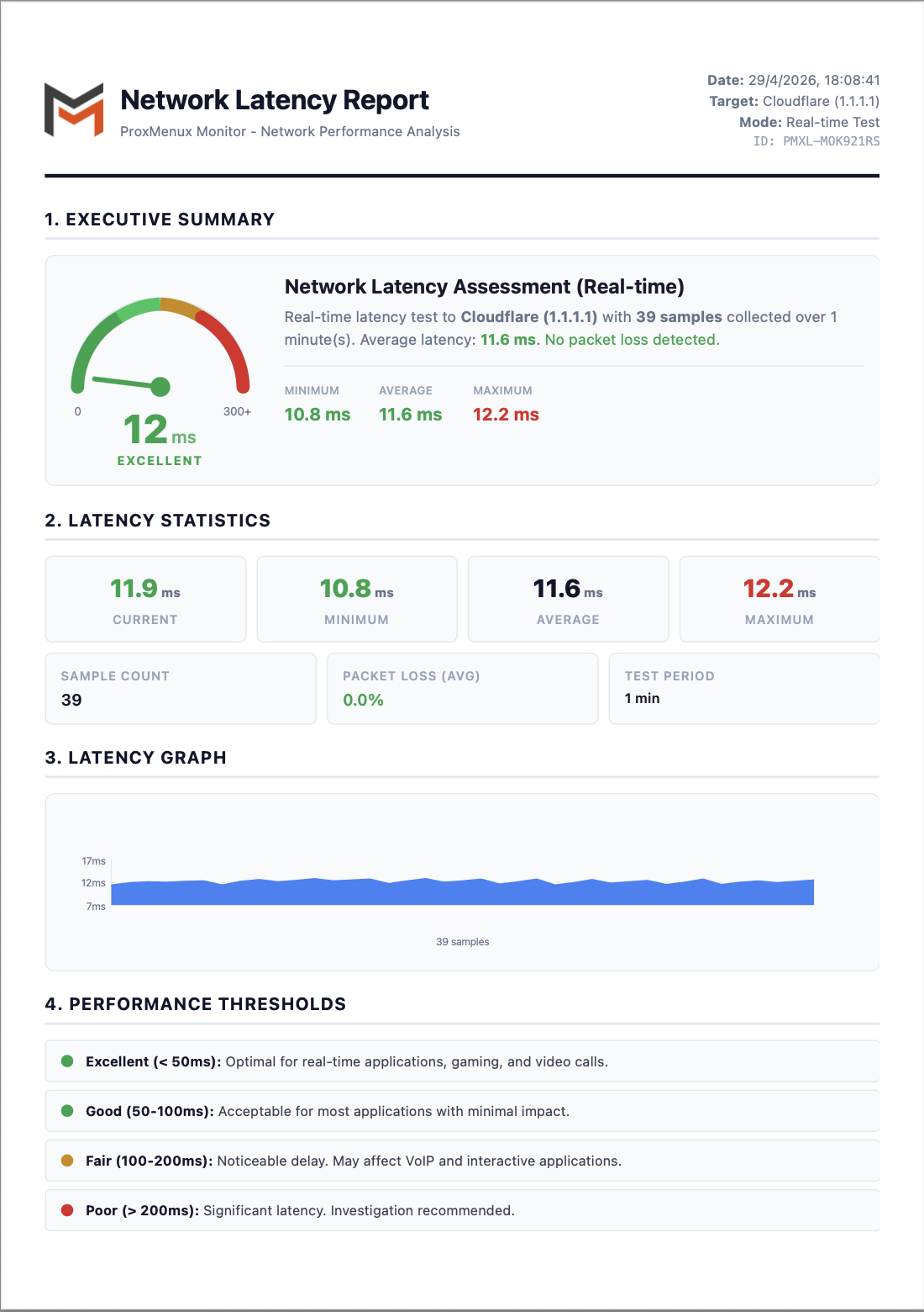
The report has six sections:
- Executive Summary — gauge dial (0–300+ ms with green / yellow / red zones), the status verdict (EXCELLENT / GOOD / FAIR / POOR), the target / mode / sample count and a one-line packet-loss summary.
- Latency Statistics — Current / Min / Avg / Max as four large tiles, plus Sample Count, Packet Loss (avg) and Test Period.
- Latency Graph — area chart of every sample over the test window with a min/avg/max y-axis grid.
- Performance Thresholds — the same four-tier scale documented above, with a coloured dot per tier.
- Detailed Test Results — numbered table with timestamp, latency, packet loss and status for every sample. Useful for spotting micro-bursts that the headline averages hide.
- Methodology — test method (ICMP Echo Request), samples per test (3 consecutive pings), target name, target IP and a final "Performance Assessment" paragraph derived from the verdict.
Use case: claims to your ISP
Excluding noisy interfaces
Like storages, individual interfaces can be excluded from health monitoring — useful for intentionally disabled bridges, test interfaces or NICs that are physically removed but still in the config. The flag is stored in the excluded_interfaces table and respected by the Health Monitor cycle: no warnings, no notifications, no contribution to the header status pill.
From the row's context menu, pick Exclude from monitoring. The interface stays visible in the dashboard with a purple excluded badge, and you can re-enable monitoring from the same menu.
How the data is collected
| Section of the tab | Endpoint | Source |
|---|---|---|
| Interface inventory | /api/network | ip -j addr + ip -j link + bond / bridge introspection. |
| Summary cards | /api/network/summary | Aggregation over the inventory plus per-interface up/down counts. |
| Per-interface RX/TX time series | /api/network/<iface>/metrics | /proc/net/dev sampled by the Health Monitor with byte-rate calculation. |
| Latency: current | /api/network/latency/current | A short ping burst against the configured gateway / target. |
| Latency: historical | /api/network/latency/history | Persisted samples — every 5 min by the Health Monitor cycle. |
# Cross-check the interface state seen by the dashboard
ip -br link
ip -br addr

# Verify a current latency probe end-to-end
curl -H "Authorization: Bearer <token>" \
  http://<host>:8008/api/network/latency/current | jq
Where to next
- Health Monitor — the Network category and the latency-history thresholds.
- API Reference — the network and latency endpoints.
- Integrations — Prometheus scrape exposes the same network metrics.
- Dashboard index — the other tabs.
- ProxMenux → Network — the actions side: bridge analysis, persistent interface names, backup & restart, iperf3.